What is J-Curve?
In this article, we will focus on explaining the J-Curve and understanding it.
Every bold reform or ambitious investment tends to follow the same story. Things usually look worse before they get better. Economists call this the J-Curve. It’s the idea that results first dip, sometimes sharply, before climbing to deliver meaningful gains.
You see this in Pension funds, Currency devaluations and even structural reforms. The tension is always the same: short-term pain followed by the promise of long-term reward. Global private equity fundraising fell to 592 billion dollars in the 12 months to June 2025. That’s the weakest total in seven years. Managers also returned only about 11 percent of assets to investors in the most recent year. It was the smallest payout since 2009.
This concept has profound implications for policy makers, investors and business leaders who must navigate the difficult early phases of change while maintaining confidence in eventual positive outcomes.
Understanding of the J-curve helps explain why quick fixes are often elusive in economics and why sustainable improvements typically require enduring short-term costs for long-term gains.
J-Curve Key Insights
- Patience Required: Short-term pain for long-term gain
- Timing Varies: Recovery periods differ across contexts
- Not Guaranteed: External shocks can prevent recovery
- Reverse Possible: Early gains may not be sustainable
What is the J-Curve?
The J-Curve refers to several related economic concepts that describe a pattern where an initial decline is followed by a subsequent rise, creating a shape that resembles the letter “J” when graphed over time.

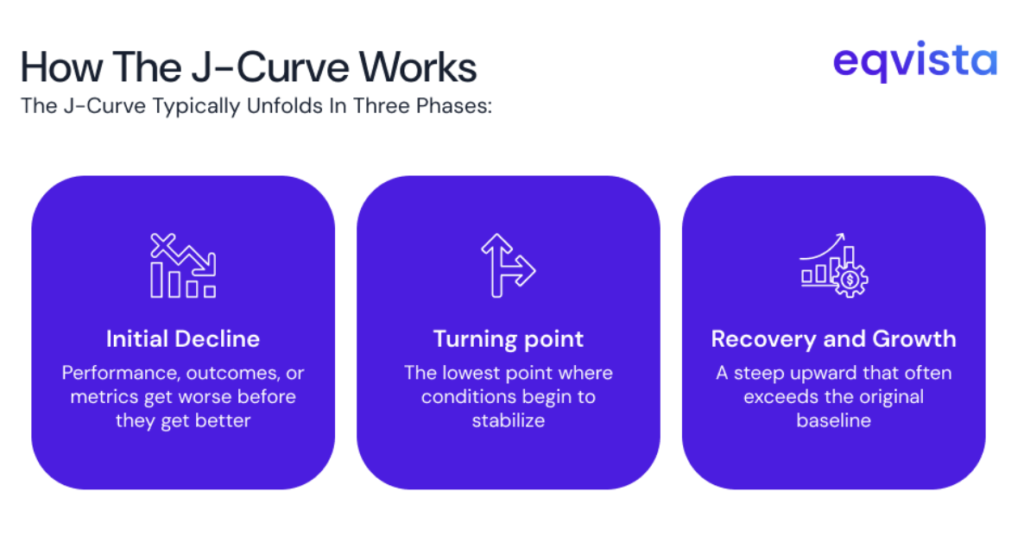
Phases of the J-Curve
- Initial Decline – Performance falls below baseline due to upfront costs, disruption, or adjustment periods
- Turning Point – The lowest point where conditions begin to stabilize and improvements start
- Recovery & Growth – Steep upward trajectory that often exceeds the original baseline
For instance, a VC startup might spend its first years on product development and customer acquisition, incurring losses, but once revenues and valuations accelerate in later funding rounds, the returns climb past the initial baseline, forming the J shape.
Understanding the J-Curve Graph
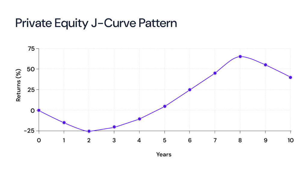
The J-curve is a graphical pattern that shows an initial decline followed by a dramatic improvement, creating a shape that resembles the letter “J” when viewed on a chart. Early in the investment life, returns dip below zero as funds are drawn and operational or growth expenses occur without immediate income.
Over time, as portfolio companies mature or assets improve, exits and gains lead to returns rising steeply upwards.

An example for J-curve
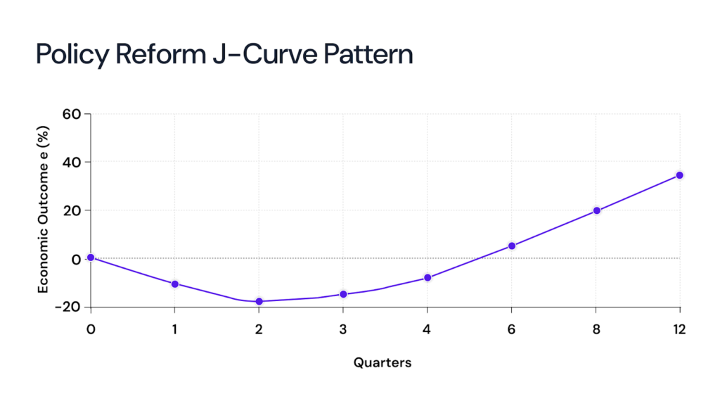
One classic example would be the famed “Abenomics” in Japan. In 2013, the Bank of Japan launched aggressive monetary easing, pledging to expand the monetary base by 60–70 trillion yen per year, while the government added a fiscal stimulus of 20.2 trillion yen. Despite the scale of these moves, Japan’s trade balance still worsened to a record 1.3 trillion yen deficit.

For policymakers, this is the hard part. Citizens see rising import costs and blame the government, even though the long-term gains are still on the horizon.
Drivers of The J-Curve in Private Equity
Even if you cover the fund lifecycle elsewhere, it helps to name the drivers. It clarifies why the dip occurs and what controls the length and depth of the trough.
- Upfront costs – Managers spend on sourcing, diligence, fees and early capex. Those cash outflows show up immediately.
- Valuation accounting – Young portfolio companies often get conservative marks until visible traction appears. That depresses reported NAVs.
- Write-offs and clean-ups – Early disposals of non-core assets deepen the initial fall but can improve later returns.
- Leverage and market access – Funds that use leverage or face weak exit markets can see the trough deepen or lengthen.
- Macro shocks – Recessions, rate shocks, or geopolitical events can delay the recovery or stop it altogether.
It helps LPs judge whether a trough is normal or a sign of structural failure.
What is the Reverse J-Curve?
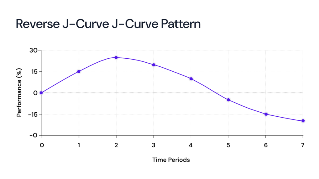
The reverse J-Curve is the mirror image. Performance improves first and then deteriorates. In macroeconomics, a currency appreciation can temporarily improve the trade balance by making imports cheaper. Over time, however, cheaper exports and weakened competitiveness can worsen outcomes. The same can happen in finance when early gains are driven by temporary market conditions that later reverse.

Recognizing a reverse J-Curve is as important as spotting a regular one. A fast early upswing can lull stakeholders into overconfidence. That makes later declines more damaging.
Some historic cases show how the theory can fail when conditions are poor.
Vintages before the 2008 crisis are instructive. Funds that invested heavily in 2006 and 2007 collapsed in exit markets. Many never recovered expected multiples. The external shock flattened their expected rebounds and left LPs with low realized returns.
How to mitigate the J-Curve
You cannot eliminate early pain entirely. You can manage it. Here are practical steps for both investors and policymakers.
For investors
- Stage capital. Commit in tranches tied to milestones rather than all at once
- Use co-investments and secondaries. These options improve portfolio liquidity and shorten cash-flow gaps.
- Stress test vintages. Model downside scenarios for macro and exit windows.
- Improve transparency. Frequent, candid updates and milestone metrics reduce LP anxiety.
For policymakers
- Design phased reforms. Implement predictable, time-bound stages that spread pain.
- Build safety nets. Targeted support for displaced workers and temporary transfers blunts political backlash.
- Communicate a clear timeline. Public buy-in depends on credible short-term markers and long-term goals.
- Monitor early indicators. If a J-Curve persists beyond expectations, pivot or add policy levers.
Limitations of the J-Curve
The J-Curve is a useful framework. But it isn’t flawless.
- It´s not a promise. The curve describes what often happens, but it doesn’t guarantee recovery. In private equity, weak deals, bad timing, or over-leverage can leave a fund stuck in the trough.
- Timing is unpredictable. Some funds show returns in three years, others take seven or more. Economies behave the same way. Russia’s post-Soviet reforms dragged far longer than expected. Instead of sparking growth, slow institution-building and corruption created heavy social costs.
- It can become a buzzword. Too often, GPs and policymakers use the J-Curve to justify underperformance. Without milestones—like operational KPIs or fiscal targets—it risks becoming an excuse instead of a diagnostic tool.
Turning J-Curve Risks into Opportunities
The J-Curve effect is a characteristic of private equity and venture capital investments, reflecting the time it takes for capital deployment, operational improvement, and eventual value realization. Awareness of the J-Curve and its drivers also aids in comparing investment types and fund strategies for better decision-making. Those who understand this and prepare for it are the ones who capture the upside when others step back.
With Eqvista’s accurate equity management and valuation tools, you will be better prepared to navigate the curve in the business cycle. Contact us to know more!
Interested in issuing & managing shares?
If you want to start issuing and managing shares, Try out our Eqvista App, it is free and all online!